ZITADEL's New and Improved User Onboarding Process
Initial Position
From user feedback and our own observation, we got quite a few hints that instance owners get lost after their initial onboarding with what to do next. So we knew that we had to do something about it. Our first thought was an informational email with further instructions and provided links, but it was clear to us that this wasn’t a proper solution and was a bit outdated. So we thought of a more direct “in-app” approach that is more interactive.
What We Wanted to Improve
After some research, we came to the conclusion that the home page in the console is where most of our customers “get stranded” and that provides the most visibility to our new guiding. We want to give the user some guidance on what could be helpful to set up next and what is missing for a successful authentication experience. We want the instance owner to feel more engaged in the setup process.

Our New Approach
To achieve this new interactive setup for our customers, we thought of a small “to-do list” with some gentle gamification to keep them engaged. And we wanted the home page of the console to focus on these next steps rather than the general shortcuts the old page had.
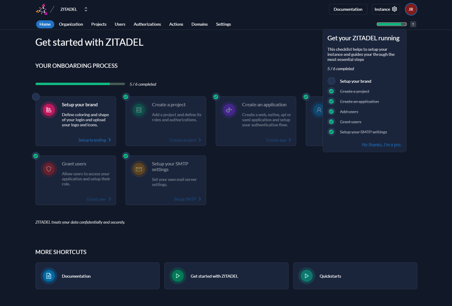
So we added a progress bar that is prominently visible on the start page so the instance owner can see how far in they are with the setup. This progress bar will also show in a smaller form in the header at all times. When the setup is complete (as far as the guidance goes) this progress bar will be removed.

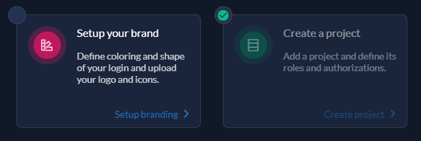
These steps in the progress bar are shown on the start page as cards, declaring each step and with a short description of what it is about. Steps that are already done will be faded out and checked so the user can see at first glance which steps are done and which are still to do.

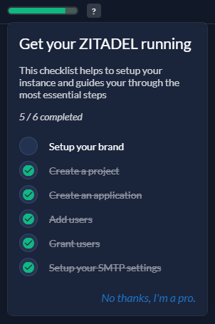
Furthermore, by hovering over the small progress bar, the user can instantly overview this list in a more compact form anywhere in the ZITADEL console with direct links to the according subpage for the task. Here the user can also opt out of this guidance if they don’t want that additional information.

This all results in the new start page that looks like this:

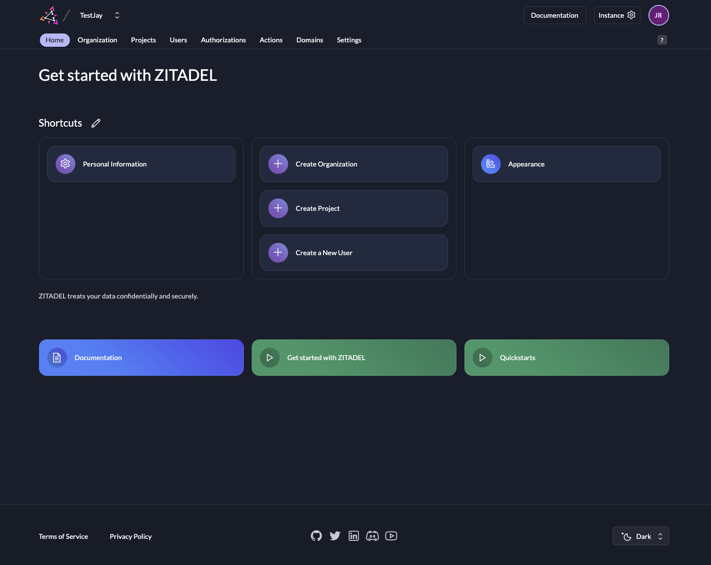
You can see that we still provide the help links but put them a bit further down the list. Note that once the progress is completed, the progress steps will convert to normal shortcuts and provide the user with direct links to the most used pages.
Conclusion
With these changes, we hope to provide a smoother setup process, especially for new customers. But this should also come in handy for our more veteran ZITADEL users, as it gives them a handy checklist for what they might haven’t set up yet.
We are constantly trying to enhance the user experience and if you have any suggestions on how to improve our workflow or ZITADEL in general, feel free to let us know.